Color Drenching Your Living Room: A Step-by-Step Guide
Welcome to lesofa.club, where we explore the art of creating stunning, comfortable living spaces. Today, we’re diving into one of the most impactful and on-trend design techniques: color drenching. If you’re tired of predictable interiors and crave a living room that makes a powerful, immersive statement, this comprehensive color drenching living room guide is for you. From selecting the perfect hue to painting every surface, we’ll walk you through transforming your space into a cohesive sanctuary of color.
What Exactly is Color Drenching?
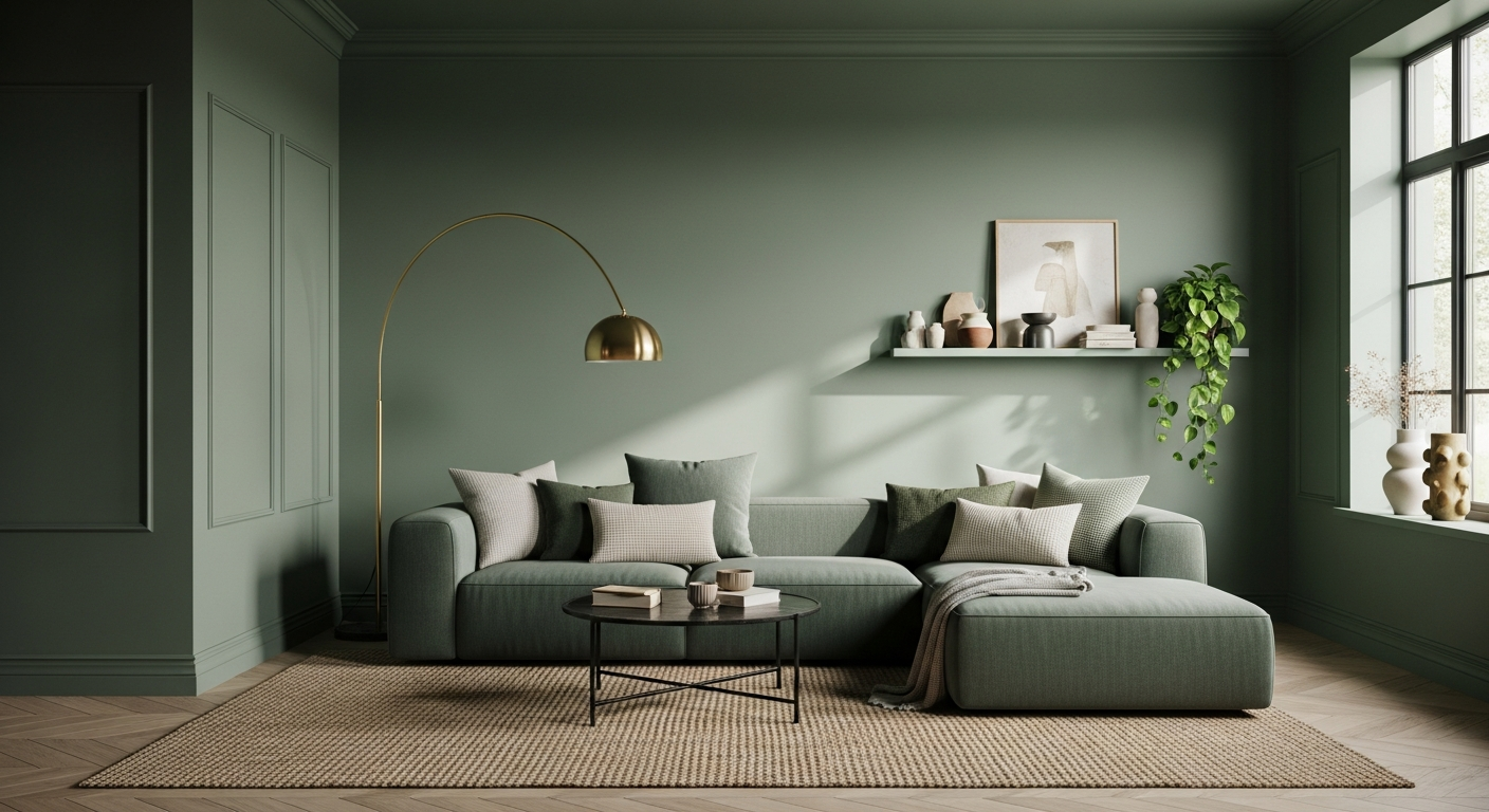
At its heart, color drenching is the art of immersing a room in a single shade, extending it beyond just the walls to encompass the ceiling, trim, doors, and sometimes even furniture and textiles. Unlike a monochromatic scheme that plays with various shades and tones of one color, color drenching aims for a seamless, all-encompassing wash of a specific hue. The result is a sophisticated, enveloping atmosphere that feels both modern and incredibly chic.
Why Embrace Color Drenching in Your Living Room?
- Creates Cohesion: By blurring the lines between surfaces, a room feels larger and more unified.
- Elevates Sophistication: It’s a bold design choice that exudes confidence and a designer aesthetic.
- Enhances Mood: A single, enveloping color can profoundly impact the emotional feel of a space, from tranquil blues to energizing reds.
- Highlights Texture: When color is consistent, the focus shifts to the tactile qualities of your furnishings and architectural details.
- Offers a Unique Backdrop: Art and decorative objects pop against a singular color backdrop in a way they wouldn’t against a multi-colored or neutral palette.
Step 1: Choosing Your Signature Shade
This is arguably the most critical step in your color drenching journey. The right color will define the mood and success of your living room. Consider the following:
Understanding Color Psychology
- Cool Tones (Blues, Greens, Purples): Often evoke calmness, tranquility, and expansiveness. A deep navy blue paint could create a sophisticated, cozy den.
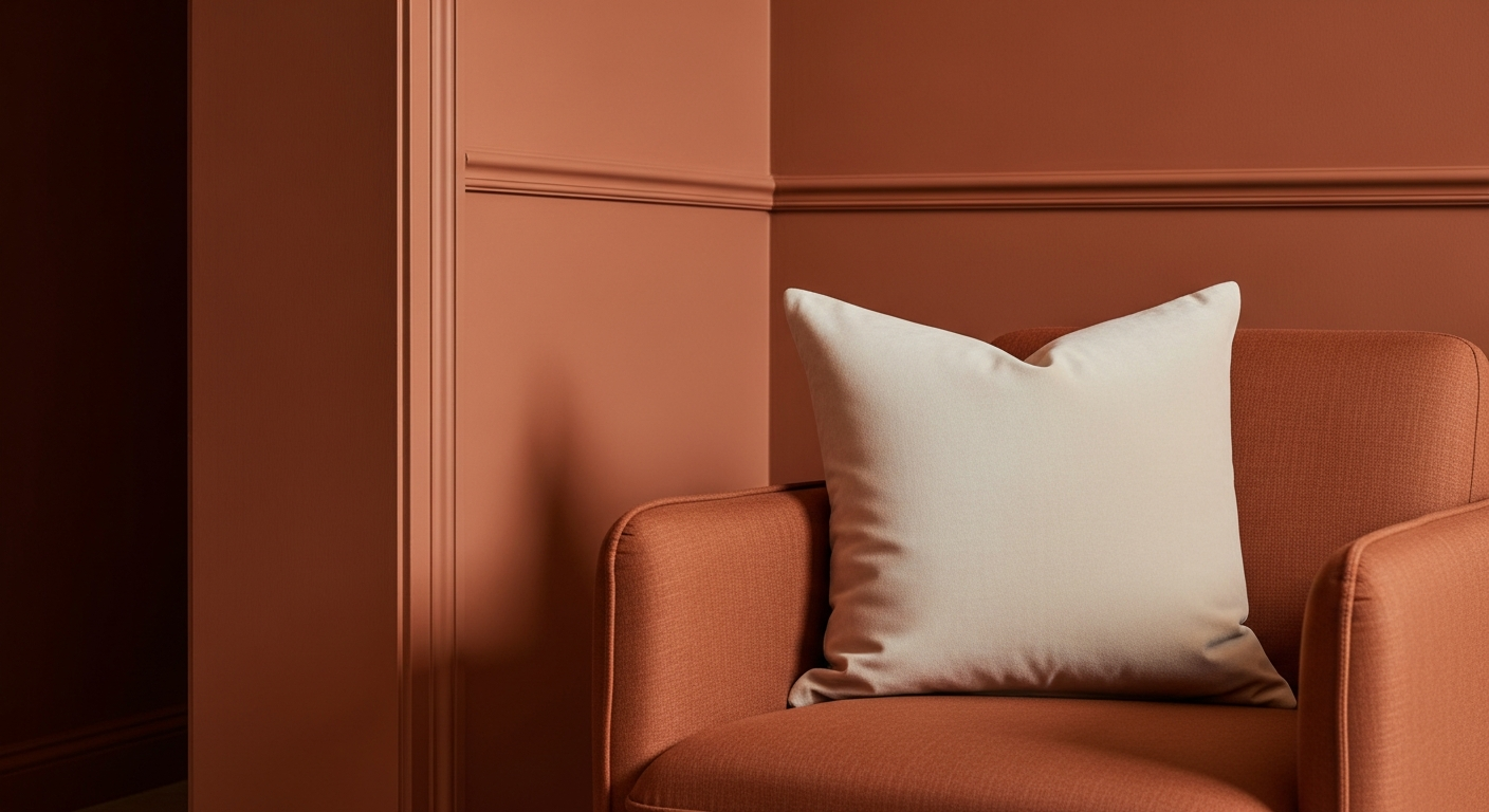
- Warm Tones (Reds, Oranges, Yellows): Can stimulate energy, warmth, and conversation. A muted terracotta or a rich burnt orange paint can make a living room feel incredibly inviting.
- Neutrals (Grays, Beiges, Whites): While seemingly safe, a drench in a rich charcoal or a warm greige can be incredibly elegant and understated, allowing textures to truly shine.
Factors to Consider for Your Living Room
- Natural Light: Rooms with ample natural light can handle deeper, more saturated colors without feeling small. North-facing rooms might benefit from warmer tones to counteract cooler light, while south-facing rooms can embrace cooler hues.
- Room Size: Darker colors tend to make a room feel cozier and more intimate, while lighter colors can make it feel more expansive. However, in color drenching, even a dark color can make a small room feel grand and intentional rather than cramped.
- Existing Elements: Do you have a beloved piece of art, a unique fireplace, or a stunning view? Your chosen color should complement these elements, not compete with them.
- Your Personal Style: Ultimately, this is your home. Choose a color that genuinely resonates with you and makes you feel good.
Pro Tip: Don’t just pick a color from a tiny swatch. Buy several sample pots of paint – ideally in varying finishes (matte, eggshell, satin) – and paint large swatches on different walls, including the ceiling, if possible. Observe them throughout the day in different lighting conditions. This is an investment that will save you from costly mistakes.
Step 2: Preparing Your Living Room for the Drench
Preparation is key to a flawless finish. Don’t rush this stage!
Clearing and Cleaning
- Remove all furniture, art, and accessories. If large pieces can’t be removed, gather them in the center of the room and cover them thoroughly with drop cloths.
- Clean your walls, ceiling, and trim meticulously. Dust, cobwebs, and grime will show through fresh paint. Use a mild all-purpose cleaner and a damp cloth, then rinse and allow to dry completely.
Patching and Priming
- Fill any holes or cracks with spackle. Sand smooth once dry.
- For unpainted or dark surfaces, or if you’re making a dramatic color change, priming is essential. A good quality interior paint primer ensures better adhesion, truer color, and a more uniform finish, especially with rich, saturated hues. Consider a tinted primer close to your final color.
Taping and Protecting
- Use high-quality painter’s tape to protect windows, door hardware, and light fixtures you don’t intend to paint.
- Cover floors thoroughly with drop cloths or plastic sheeting.
Step 3: The Art of Painting – Walls, Ceiling, and Trim
Now for the fun part! While traditionally ceilings are white and trim is contrasting, color drenching demands a unified approach.
Painting Order
- Ceiling: Start here to catch any drips on the walls below. Use an extension pole for rollers to ensure even coverage.
- Trim (Baseboards, Door Frames, Window Frames): Paint these next. Don’t worry about being perfectly neat against the walls, as you’ll be painting the walls with the same color.
- Walls: Begin by cutting in around the edges with a brush, then use a roller for the main surfaces. Apply thin, even coats to avoid drips and streaks.
- Doors: Paint both sides of any interior doors in the room.
Choosing the Right Paint Finish
The finish dramatically affects how your chosen color appears and reflects light. Experiment with samples!
- Matte/Flat: Offers a sophisticated, velvety look that absorbs light. Great for hiding imperfections and creating a dramatic, museum-like feel.
- Eggshell/Satin: A popular choice for living rooms, offering a subtle sheen that is more durable and easier to clean than matte.
- Semi-Gloss/High-Gloss: Highly reflective and durable, these finishes can create a dramatic, almost lacquered effect, particularly striking on trim or doors to add subtle depth within the same color.
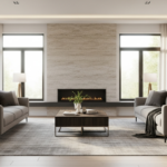
Achieve a cohesive look with this color drenching living room guide.
Step 4: Integrating Furniture and Accessories
Once the paint is dry, the real magic of color drenching comes to life as you bring in your furnishings. The goal is to let your selected color be the dominant force, allowing textures and subtle variations to create interest.
Furniture Choices
- Seamless Integration: If possible, choose furniture pieces (especially larger ones like a sectional sofa in blue or an accent chair) in the same or a very closely related shade as your walls. This creates a powerful, enveloping effect.
- Contrasting Textures: If your sofa is the exact color of the walls, introduce texture through its fabric – think velvet, linen, or bouclé.
- Subtle Contrast: Alternatively, use furniture in a slightly darker or lighter tone of your main color for subtle depth, or introduce a complementary neutral like a deep charcoal against a forest green, or a soft beige against a blush pink.
Layering with Textiles and Decor
This is where you prevent the room from feeling flat. Since the color is unified, textures, patterns, and subtle sheen variations become crucial.
- Rugs: A large wool area rug in a complementary neutral, a texture-rich jute, or even a subtly patterned rug in a similar color palette will ground the space.
- Throw Pillows & Blankets: Use various fabrics like faux fur, knit, silk, or chenille. Opt for pillows in the drenching color, a complementary neutral, or a subtle pattern that incorporates your main hue.
- Curtains: Floor-to-ceiling curtains in the same color as your walls will enhance the drenching effect, making the room feel taller and more luxurious. Alternatively, opt for sheers in a subtle tone.
- Art & Mirrors: These are your opportunity to introduce different colors, metallics, or reflective surfaces that truly pop against the unified backdrop. Consider gallery walls with frames in metallic finishes or art with a dominant complementary color.
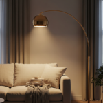
- Lighting: Introduce various light sources – floor lamps, table lamps, and ceiling fixtures – to create different moods and highlight specific areas. Metallics (brass, chrome, black iron) or ceramic bases can add visual interest.
Step 5: Maintaining Your Drenched Living Room
A beautifully drenched room requires ongoing care to look its best, especially with light colors or high-traffic areas.
- Regular Cleaning: Dust walls and trim gently with a microfiber cloth. For marks, spot clean carefully with a damp cloth and mild soap.
- Touch-ups: Keep a small amount of your chosen paint for touch-ups. Nicks and scuffs will be less noticeable on a uniformly colored surface, but addressing them promptly keeps the look pristine.
- Fabric Care: For sofas and upholstered items, follow manufacturer cleaning instructions. For general spills, a good quality upholstery cleaner stain remover can be a lifesaver.
Color Drenching Living Room Guide: Comparison Table
| Design Style | Color Approach | Key Characteristics | Impact |
|---|---|---|---|
| Color Drenching | Single, saturated hue across walls, ceiling, trim, and often furniture. | Immersive, cohesive, sophisticated, bold. Blurs architectural lines. | Creates an enveloping, unified, and often dramatic atmosphere. Feels larger, highlights texture. |
| Monochromatic | Varying shades, tints, and tones of a single color. | Layered, subtle, harmonious, elegant. Uses different values of one hue. | Calm, refined, and visually spacious without being overwhelming. Depth through variation. |
| Accented / Contrasting | Main neutral or base color with one or more contrasting accent colors. | Dynamic, energetic, traditional. Walls are often neutral, accents pop. | Adds visual interest and focal points. Can feel less unified but more vibrant. |
Common Mistakes to Avoid
- Skipping Samples: Never guess! Colors look drastically different on a small swatch than on a large surface.
- Neglecting Finishes: The paint finish is as important as the color. A matte finish will look very different from a satin or semi-gloss in the same shade.
- Ignoring Lighting: Natural and artificial light sources dramatically impact how a color appears throughout the day and night.
- Forgetting Texture: Without variations in texture, a color-drenched room can feel flat. Layer materials!
- Over-Decorating: Let the color be the star. Choose accessories thoughtfully to complement rather than clutter.
Frequently Asked Questions About Color Drenching
Q1: Can I color drench a small living room?
Absolutely! Color drenching is particularly effective in small spaces. By painting everything the same color, you eliminate visual breaks, making the room feel more expansive and purposeful, rather than cramped. A dark color can make a small room feel like a jewel box.
Q2: Do I have to paint the ceiling the exact same color?
For a true color drenching effect, yes. Painting the ceiling the same color as the walls creates the seamless, enveloping feel that defines this technique. If you’re hesitant, consider a slightly lighter tint of your chosen color for the ceiling, but aim for minimal contrast.
Q3: What if I have white trim already? Do I have to paint it?
To achieve the full color drenching impact, painting the trim (baseboards, window frames, door frames) the same color as the walls is highly recommended. White trim would break up the visual flow, counteracting the seamless effect you’re trying to create.
Q4: How do I prevent a color-drenched room from feeling too dark or monotonous?
The key is layering and texture! Introduce variations in texture through textiles (rugs, throws, pillows), furniture materials (wood, metal, leather), and decorative objects. Use reflective surfaces like mirrors, glass, and metallic accents to bounce light around. Incorporate varied lighting sources and consider a few pieces of art that offer a pop of complementary or contrasting color.
Q5: Is color drenching just a trend, or is it here to stay?
While the term ‘color drenching’ is trendy, the concept of immersive color has roots in traditional design. It’s a sophisticated technique that offers a unique sense of calm and luxury. Its versatility, allowing for both bold statements and subtle elegance, suggests it will remain a cherished design choice for those seeking impactful interiors beyond passing fads.
Conclusion: Embrace the Power of Immersive Color
Color drenching is more than just a painting technique; it’s a design philosophy that transforms your living room into a truly immersive and personal space. By following this color drenching living room guide, you have the tools to create a cohesive, sophisticated, and deeply atmospheric environment that reflects your style. Don’t be afraid to be bold, trust your instincts, and prepare to fall in love with your newly drenched living room. Happy painting!
Discover more design inspiration and quality home furnishings at lesofa.club.