Integrating Meditation Spaces into Your Living Room Layout: A Path to Serenity

In our fast-paced world, finding moments of peace and quiet has become more crucial than ever. For many, the idea of a dedicated meditation room feels like an unattainable luxury. But what if you could carve out a tranquil sanctuary right within the heart of your home? Welcome to the concept of an integrated meditation space living room – a harmonious blend of mindfulness and modern living.

The living room, often the most dynamic and communal area in a home, might seem an unlikely candidate for a contemplative corner. However, with thoughtful design and strategic placement, it can transform into a profound haven for daily practice, offering immediate accessibility to calm and focus. This comprehensive guide from lesofa.club will walk you through the why, how, and what of creating a beautiful and functional meditation space that seamlessly complements your living room layout, enhancing both your home’s aesthetic and your personal well-being.

The Why and How: Benefits of a Dedicated Meditation Space

Integrating a meditation space into your living room offers a myriad of benefits that extend beyond just convenience:

  • Increased Practice Consistency: A visible, designated spot acts as a constant, gentle reminder to pause and practice, making mindfulness a more consistent part of your routine.
  • Enhanced Mental Well-being: Regular meditation reduces stress, improves focus, and fosters emotional resilience. Having a dedicated area signals to your brain that it’s time to unwind.
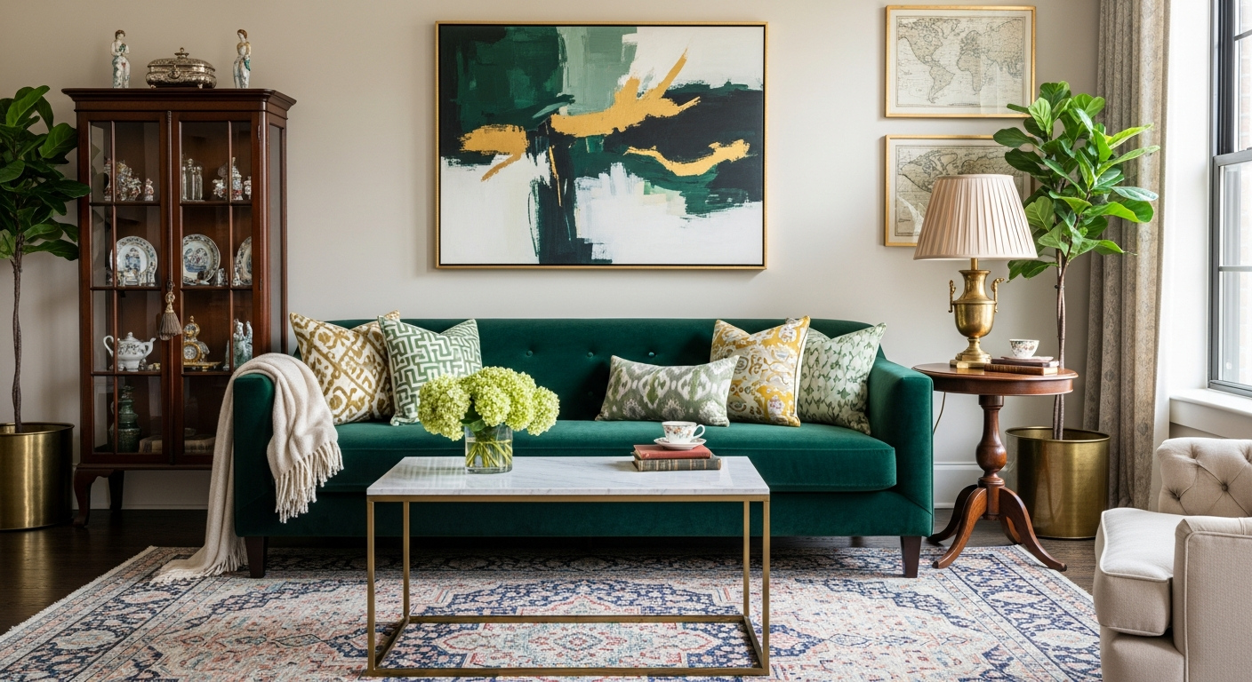
  • Optimized Home Aesthetics: Far from being an awkward addition, a well-designed meditation nook can elevate your living room’s style, adding an element of serene sophistication.
  • Multi-functional Space: Even a small corner can serve as both a personal retreat and a beautifully curated design feature, proving that you don’t need an entire room to find your zen.

Dispelling the myth that meditation requires a monastery-like setting, we aim to show you how everyday items and clever design can turn an ordinary corner into an extraordinary escape.

Planning Your Meditation Nook: Key Considerations

Before you start moving furniture, consider these foundational elements to ensure your meditation space is both effective and aesthetically pleasing.

Location, Location, Location: Finding Your Spot

The success of your meditation space living room largely depends on its placement. Look for:

  • A Quiet Corner: Ideally, choose a spot away from high-traffic pathways, television glare, and noisy windows. A corner often provides a sense of enclosure and privacy.
  • Natural Light: Proximity to a window can be wonderfully uplifting, connecting you with the outside world while maintaining a sense of inner calm. However, ensure direct harsh sunlight can be diffused with blinds or sheer curtains.
  • Minimal Distractions: Avoid placing your space directly opposite busy shelves or distracting decor. Simplicity is key here.

Size Matters (or Doesn’t): Maximizing Small Spaces

You don’t need a sprawling area. Even a modest 3×3 foot section can be transformed. Consider:

  • Behind a Sofa: The back of a large sofa can naturally create a secluded alcove.
  • Between Bookcases: A gap between two tall bookshelves can become a cozy, contemplative niche.
  • Alcoves or Bay Windows: These architectural features are naturally conducive to creating distinct zones.

Aesthetic and Ambiance: Setting the Mood

The visual and sensory elements play a crucial role in creating a calming atmosphere.

  • Color Palette: Opt for soothing, natural colors like soft blues, gentle greens, warm grays, or earthy tones. These colors promote relaxation and focus.
  • Lighting: Harsh overhead lights are a no-go. Think soft, ambient lighting. Dimmers, strategically placed lamps, or even candlelight can create a warm, inviting glow.
  • Scents and Sounds: Subtle elements can deepen your practice. Consider an essential oil diffuser with lavender or sandalwood, or a small water feature for gentle background noise.

Essential Elements for Your Meditation Space Living Room

Once you’ve identified your spot, it’s time to furnish it with items that support your practice and enhance the serene atmosphere.

Comfortable Seating: Grounding Your Practice

The right seating is paramount for comfort during meditation, allowing you to focus on your breath rather than discomfort.

  • Meditation Cushions (Zafus and Zabutons): A meditation cushion (zafu) provides elevation for your hips, aligning your spine and promoting good posture. A zabuton is a larger, flat mat placed under the zafu to cushion your knees and ankles. Together, they create a comfortable base for sitting.
  • Meditation Benches: For those who prefer kneeling, a meditation bench can relieve pressure on the knees and ankles, providing a stable and comfortable upright posture.
  • Floor Pillows or Low Chairs: If traditional meditation seating isn’t for you, large, firm floor pillows or a low, comfortable accent chair can offer a good alternative, especially if your practice involves light stretching or a more relaxed posture.

Sensory Enhancements: Engaging Your Senses

Appeal to your senses to create a truly immersive and peaceful environment.

  • Lighting: Beyond dimmers, consider a Himalayan salt lamp for its soft, warm glow and purported air-purifying properties. Flameless LED candles offer a safe alternative to real flames, while string lights can add a magical touch.
  • Sound: A small, tabletop water fountain, gentle wind chimes, or a Bluetooth speaker playing calming ambient music or guided meditations can help block out household noise and deepen your focus.
  • Scent: An essential oil diffuser with calming scents like lavender, frankincense, or bergamot can significantly enhance relaxation. Incense sticks or palo santo wood can also be used, but ensure good ventilation.

Decorative Touches: Inspiring Serenity

Thoughtful decor can turn your meditation space into a visual anchor for peace.

  • Plants: Living plants like a snake plant, peace lily, or a small bonsai tree bring nature indoors, improve air quality, and add a touch of tranquility.
  • Art and Mandalas: A simple, calming piece of art, a mandala tapestry, or a sculpture can serve as a focal point for contemplation.
  • Rugs: A soft, textured rug, such as a plush area rug, can define your space, add warmth, and provide extra comfort underfoot. Choose natural fibers like cotton, wool, or jute.

Integrating with Your Existing Living Room Layout

The trick to a successful meditation space living room is seamless integration, making it feel like an intentional part of the whole, rather than an afterthought.

Seamless Blending: Aesthetics and Functionality

To avoid your meditation nook looking out of place, ensure it harmonizes with your existing living room decor.

  • Cohesive Color Schemes: Use similar colors, textures, or materials from your main living room decor in your meditation space to create visual continuity.
  • Room Dividers: For open-plan living rooms or if you desire more privacy, a decorative screen, a sheer curtain, or even a tall plant can subtly demarcate your meditation area without completely closing it off.
  • Furniture Placement: Arrange your existing living room furniture in a way that naturally cradles or frames your meditation spot, making it feel like a part of the overall design.

Storage Solutions: Keeping it Tidy

A clutter-free space is essential for a clear mind. Incorporate smart storage to keep your meditation essentials organized and out of sight when not in use.

  • Baskets and Bins: A beautiful wicker storage basket or decorative fabric bin can hold extra cushions, blankets, or journals.
  • Storage Ottomans: A multi-functional ottoman can serve as extra seating for guests and hide away your meditation gear.
  • Shelving: A small wall-mounted shelf or a slim console table can hold your essential oil diffuser, a small plant, or a meaningful object without taking up floor space.
meditation space living room style example
This inviting corner demonstrates how a dedicated meditation space living room can blend seamlessly.

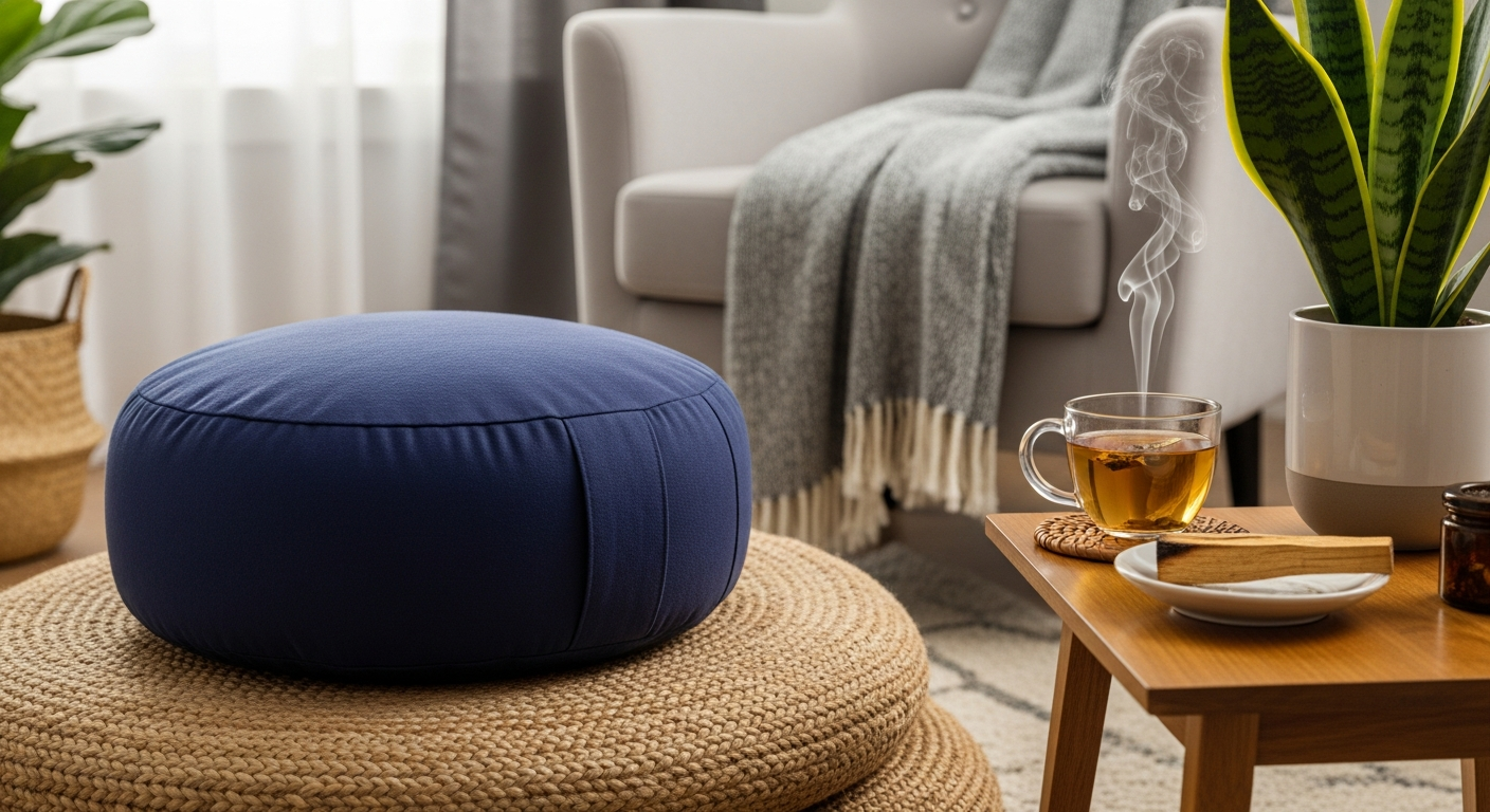
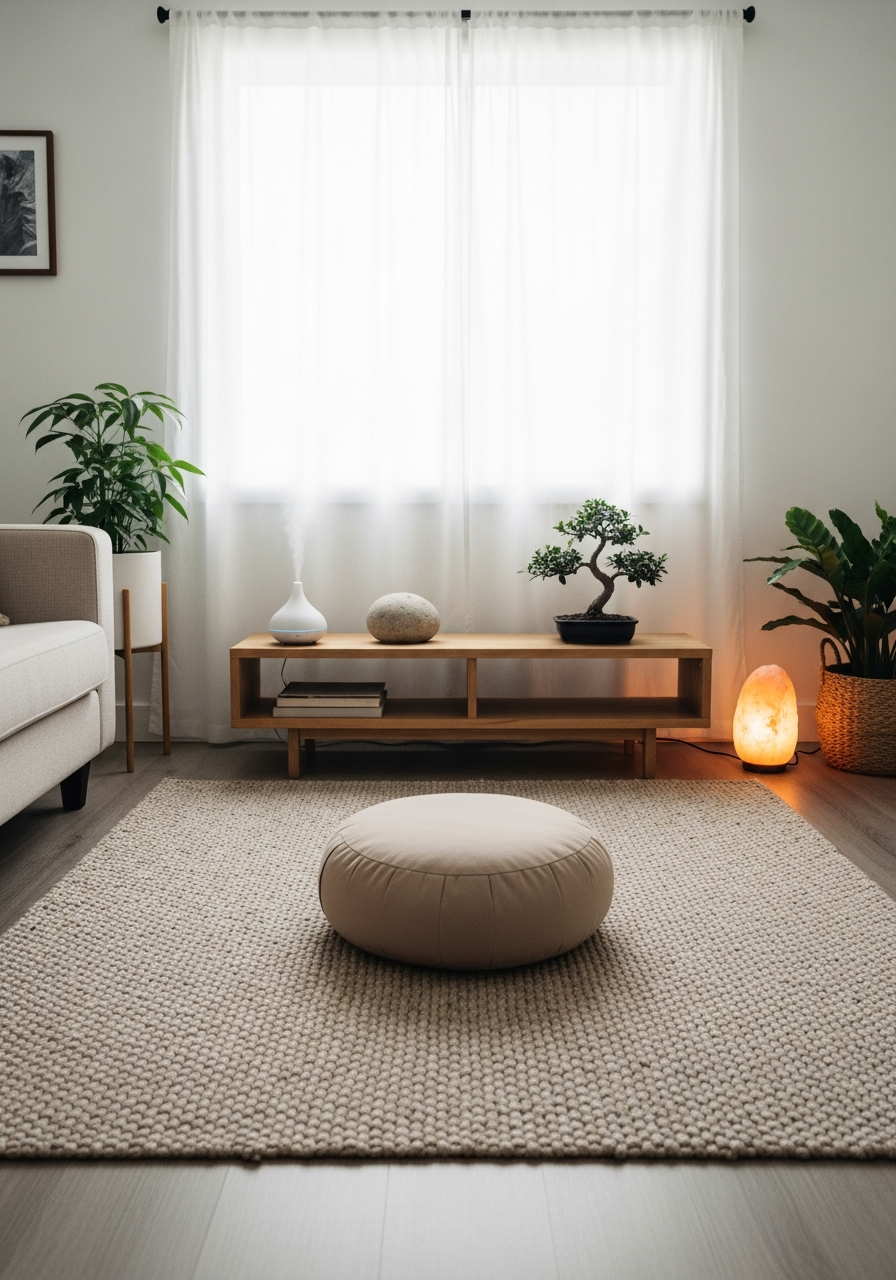
This inviting corner demonstrates how a dedicated meditation space living room can blend seamlessly with existing decor, offering a peaceful retreat without sacrificing style.

Multi-Functional Furniture: The Smart Approach

For truly compact living rooms, consider furniture that serves a dual purpose:

  • Daybeds or Sofas with Chaise: A section of a daybed or a sofa with a chaise can be temporarily cleared for meditation, then returned to its usual function.
  • Console Tables: A slim console table can serve as an altar during meditation, holding candles or statues, and then revert to holding remotes or decor items.
  • Large Ottomans: A generously sized ottoman can double as a floor cushion or a surface for a singing bowl.

Meditation Space Styles & Their Living Room Integration

Here’s a quick comparison of different meditation space styles and how they can be integrated into various living room layouts:

Style Key Elements Best for Living Room Type Integration Tips
Minimalist Zen Clean lines, neutral colors, natural materials (wood, stone), single plant, simple cushion. Modern, contemporary, or small living rooms. Maintain open space. Use a low platform or simple cushion. Hide clutter in sleek storage. Natural light is key.
Bohemian Retreat Layered textiles, floor cushions, lush plants, tapestries, warm lighting, natural textures. Eclectic, artistic, or cozy living rooms. Blend with existing textures and patterns. Use an area rug to define the zone. Add floor pillows and throws.
Modern Sanctuary Comfortable lounge chair, subtle lighting, sophisticated diffuser, curated art, soft rug, smart tech. Transitional, luxurious, or spacious living rooms. Choose high-quality, comfortable pieces. Integrate smart home lighting. Ensure electronics are discreetly placed.

DIY Hacks and Budget-Friendly Ideas

Creating a beautiful meditation space doesn’t have to break the bank. Here are some savvy tips:

  • Repurpose and Upcycle: An old chest can become storage, a sturdy wooden box can be a makeshift meditation bench, or old blankets can be restitched into floor cushions.
  • Thrift Store Finds: Look for unique vases for plants, interesting sculptures, or decorative trays at local thrift stores.
  • Natural Elements: Collect smooth stones, beautiful branches, or pinecones from nature to decorate your space for free.
  • DIY Lighting: String fairy lights around a plant or inside a glass jar for a magical glow.

Maintaining Your Sacred Space

Once your meditation space is established, a little maintenance goes a long way in preserving its tranquility.

  • Regular Decluttering: Keep the area free of non-meditation-related items. A tidy space promotes a clear mind.
  • Cleaning: Regularly dust surfaces and vacuum the rug or floor cushions. For a quick refresh, consider an eco-friendly all-purpose cleaner that leaves a subtle, pleasant scent without harsh chemicals.
  • Refresh Elements: Periodically change essential oil scents, swap out plants, or rotate art to keep the space feeling fresh and inspiring.
  • Energy Clearing: Some people like to periodically “clear” the energy of their space using sage, palo santo, or simply by opening a window to let in fresh air.

Frequently Asked Questions (FAQ)

Here are answers to common questions about creating a meditation space living room:

Q1: How much space do I really need for a meditation area?

A: Very little! Even a small 3×3 foot corner is often sufficient. The key is to create a distinct zone, not necessarily a large one. Focus on verticality if floor space is limited, using wall-mounted shelves or tall plants.

Q2: Can I just use my existing couch for meditation?

A: While possible, a couch may not provide the optimal posture for seated meditation. A dedicated cushion or bench helps align your spine, making long periods of sitting more comfortable and conducive to focus. However, for lying meditations or short moments of reflection, a comfortable sofa is perfectly fine.

Q3: What colors are best for a meditation space?

A: Calming, natural tones work best. Think soft blues, greens, grays, creams, and earthy browns. Avoid overly bright or stimulating colors, which can be distracting.

Q4: How do I deal with noise and distractions in a busy living room?

A: Strategic placement away from high-traffic zones helps. Noise-canceling headphones, ambient nature sounds, or a white noise machine can also be very effective. Setting clear boundaries with family members about your meditation time is also crucial.

Q5: What if I have pets or young children who might disturb the space?

A: This requires some gentle management. Consider a portable screen or a decorative room divider during your meditation time. For pets, provide them with their own comfy spot nearby. For children, you might involve them by teaching them about mindfulness, or choose times when they are napping or engaged in other activities.

Conclusion: Your Path to Inner Peace Begins at Home

Creating a meditation space living room is more than just a home decor project; it’s an investment in your mental, emotional, and spiritual well-being. By thoughtfully integrating a serene nook into your living area, you create a constant invitation to pause, breathe, and reconnect with yourself amidst the rhythms of daily life. It proves that tranquility isn’t just for secluded retreats, but can be a cherished part of your everyday home experience.

Begin your journey today and discover the profound impact a dedicated space can have on your mindfulness practice and overall quality of life. Share your tips and creations with the lesofa.club community in the comments below – we’d love to see how you bring serenity into your living room!

How to Match a Vintage Rug to a Statement Colored Sofa

In the vibrant world of interior design, few elements command attention quite like a statement-colored sofa. It’s a bold declaration, a focal point that anchors a room and expresses personality. But what happens when you introduce the rich history and unique character of a vintage rug into this equation? The challenge then becomes a delightful design puzzle: how to seamlessly match a vintage rug to a statement colored sofa, creating a space that feels both cohesive and captivating, rather than chaotic.

At lesofa.club, we believe that your home should tell a story, and the pairing of a vintage rug with a striking sofa offers an unparalleled opportunity for narrative depth. This comprehensive guide will walk you through the intricacies of color theory, pattern play, and stylistic harmony, empowering you to confidently combine these two powerful design elements. Forget safe neutrals; it’s time to embrace color and history to craft a truly unique and inviting living space.

The Allure of Vintage Rugs and Statement Sofas

Before diving into the ‘how,’ let’s appreciate the ‘why.’ Vintage rugs, whether a grand Persian rug or a minimalist Beni Ourain rug, carry a soul. They are testaments to craftsmanship, featuring patterns and colors that have evolved through generations. Each knot tells a story, each faded hue a memory. Their imperfections are part of their charm, adding warmth, texture, and an unparalleled sense of history to any room. Unlike mass-produced alternatives, a vintage rug offers uniqueness, often at a fraction of the cost of a new, hand-knotted piece of comparable quality.

A statement sofa, on the other hand, is about immediate impact. It’s the confident splash of emerald green velvet sofa, the playful pop of mustard yellow, or the sophisticated depth of a deep teal. These aren’t just pieces of furniture; they are declarations of style, designed to be the room’s undeniable focal point. They inject personality, energy, and a touch of drama that transforms a mundane living area into a conversation starter.

The challenge, and indeed the art, lies in marrying these two strong personalities. A vintage rug, with its often complex palette and intricate patterns, can either sing in harmony with a statement sofa or clash in a cacophony of competing visuals. Our goal is to ensure a symphony of style.

Understanding Color Theory and Dominance

The foundation of any successful design pairing, especially when dealing with bold colors and intricate patterns, is a solid grasp of color theory. This isn’t about rigid rules, but rather understanding how colors interact and influence each other.

Key Color Theory Concepts:

  • Dominant Colors: Identify the most prominent color(s) in your vintage rug. This might be a bold red, a deep blue, or a more muted overall tone. Similarly, your statement sofa’s color is its dominant hue.
  • Secondary & Accent Colors: Look for the smaller splashes of color within the rug’s pattern. These are often the bridge colors that can tie into your sofa or other room elements.
  • Undertones: Every color has an undertone—warm (yellow, orange, red) or cool (blue, green, purple). A sage green sofa might have a cool blue undertone, while a terracotta rug might have a warm orange undertone. Understanding these subtle nuances is crucial for harmony.
  • The 60-30-10 Rule: This classic design principle suggests that 60% of a room should be the dominant color, 30% a secondary color, and 10% an accent color. While flexible, it’s a great guideline for maintaining balance, especially when you match vintage rug to sofa and other decor elements.

Strategies for Harmonizing Hues

Once you’ve analyzed the colors, it’s time to strategize your pairing:

Complementary Contrast

This strategy involves pairing colors that are opposite each other on the color wheel (e.g., red and green, blue and orange). If your sofa is a vibrant teal velvet sofa, consider a vintage rug that features faded oranges, rusts, or even some warm yellow tones. The contrast creates energy and visual interest, but requires careful balancing to avoid overwhelming the space. Look for rugs where the complementary color appears in smaller doses or as a muted secondary shade to ensure the contrast is sophisticated, not jarring.

Analogous Harmony

Analogous colors are next to each other on the color wheel (e.g., blue, blue-green, green). This creates a sense of calm and cohesion. If your sofa is a deep navy, a vintage rug with various shades of blue, green-blue, or even some subtle greens can work beautifully. The key here is to vary the shades and intensities to add depth without sacrificing the harmonious flow. This approach often feels very sophisticated and curated, allowing different textures and patterns to shine without color competition.

Neutral Grounding

Sometimes, the best way to highlight a bold sofa is with a more subdued rug. A statement sofa in fuchsia or sunshine yellow can be beautifully grounded by a vintage rug predominantly in cream, grey, beige, or even a soft, faded black. This allows the sofa to be the undisputed star while the rug provides a rich textural and historical backdrop without competing for color dominance. Conversely, a highly colorful, pattern-rich vintage rug might benefit from a solid, neutral-colored sofa to let the rug truly shine.

Pattern Play

Mixing patterns can be tricky, but incredibly rewarding. The secret lies in varying scale, density, and type. If your vintage rug has a dense, intricate floral pattern, pair it with a solid-colored sofa or one with a subtle, geometric texture (like a ribbed corduroy or a textured linen). If the rug features large, open geometric shapes, a small-scale patterned sofa or a subtle striped one might work. Always aim for one dominant pattern, with others playing a supporting role. Consider the overall vibe you’re aiming for – bohemian, eclectic, or more refined – as this will guide your pattern choices.

Texture Talk

Texture adds another layer of sophistication. A plush velvet sofa can contrast beautifully with a flat-woven kilim rug, while a crisp linen sofa might find its match in a soft, high-pile Moroccan rug. Don’t underestimate the power of tactile differences to enhance visual appeal and comfort. The interplay of soft, hard, smooth, and rough can elevate your room’s aesthetic significantly.

Identifying Your Vintage Rug Style

Understanding the common styles of vintage rugs can help predict their color palettes and patterns, making the matching process easier:

  • Persian Rugs: Often rich in jewel tones (deep reds, blues, greens) with intricate, curvilinear patterns. They exude formality and luxury. Examples include Kashan, Tabriz, and Heriz.
  • Turkish/Anatolian Rugs: Known for their slightly coarser weave and often more geometric or tribal patterns. Oushak rugs, for instance, are famed for their softer, muted palettes and larger, more open motifs, making them incredibly versatile to match vintage rug to sofa in a modern setting.
  • Moroccan Rugs: Characterized by their plush pile and often minimalist, abstract, or tribal geometric patterns. Beni Ourain rugs, in particular, are typically cream or ivory with black/brown geometric lines, perfect for contemporary spaces.
  • Kilim Rugs: Flat-woven, without a pile, often featuring bold geometric patterns and vibrant colors. They offer a more casual, bohemian vibe.
  • Bokhara Rugs: Originating from Central Asia, these feature repeating “gul” (elephant’s foot) motifs, usually in rich reds, browns, and blues.

Statement Sofa Colors – What Works Best?

Let’s consider how different bold sofa colors can interact with vintage rugs:

  • Emerald Green: A regal color. Pair with vintage rugs featuring warm, earthy tones like rust, terracotta, or faded gold. For a cooler, more serene look, rugs with muted blues or creams can create a sophisticated sanctuary.
  • Navy Blue: Incredibly versatile. Works with almost any vintage rug. For high contrast, look for rugs with reds, oranges, or yellows. For a calmer aesthetic, opt for rugs with lighter blues, greens, or greys.
  • Mustard Yellow: A cheerful, retro hue. Complements vintage rugs with deep blues, charcoal greys, or rich, earthy browns and burnt oranges. It also pairs beautifully with lighter, creamy Moroccan rugs.
  • Deep Teal: Sophisticated and intriguing. Best paired with vintage rugs that incorporate blush pinks, soft corals, golds, or light greys. Rugs with subtle patterns in these complementary shades will enhance the teal without overwhelming it.
  • Burgundy/Oxblood: A rich, warm tone. Vintage rugs with muted greens, creams, or even other shades of deep red and gold create a luxurious, old-world feel.
  • Blush Pink: Soft yet striking. Looks ethereal with vintage rugs in grey, white, light blue, or even some faded sage greens. Moroccan rugs are often a fantastic match for blush sofas.
match vintage rug to sofa style example
Discover how a vintage Oushak rug can perfectly match a statement mustard yellow sofa, creating warmth and character.

Discover how a vintage Oushak rug can perfectly match a statement mustard yellow sofa, creating warmth and character.

Comparison Table: Vintage Rug Styles vs. Statement Sofa Colors

This table offers a quick reference for pairing different vintage rug styles with popular statement sofa colors:

Statement Sofa Color Best Vintage Rug Styles Why it Works
Emerald Green Persian (Heriz, Tabriz) with rust/gold, Oushak with creams/pinks Warm contrast or sophisticated analogous blend.
Navy Blue Kilim with reds/oranges, Turkish with light blues/greens, Bokhara Versatile; allows for bold contrast or serene harmony.
Mustard Yellow Moroccan (Beni Ourain) with black lines, Oushak with terracotta/sage Neutral grounding or complementary warmth.
Deep Teal Persian (Kashan) with faded pink/gold, Turkish with grey/cream Creates a luxurious, sophisticated balance through soft contrast.
Blush Pink Moroccan (Azilal) with muted tones, Vintage Dhurrie with grey/white Soft harmony and adds textural depth.

Practical Tips for a Flawless Match

Beyond theory, here are actionable tips to ensure your vintage rug and statement sofa pairing is perfect:

  1. Consider the Room’s Overall Aesthetic: Is your space bohemian, minimalist, eclectic, or traditional? Your rug and sofa choice should support this overarching theme. A vibrant velvet sofa modern in design might call for a contemporary vintage rug like a Beni Ourain, rather than a heavily patterned Persian.
  2. Size Matters: The rug should be large enough to anchor the sofa, with at least the front two legs of the sofa sitting on it. Ideally, the rug extends beyond the sofa’s width by several inches on each side. A rug that’s too small will make the room feel disjointed.
  3. Embrace Imperfections: Vintage rugs are rarely pristine. Fading, wear, and minor inconsistencies are part of their charm. Don’t seek perfection; seek character. These quirks often make them easier to pair with bold, modern furniture, softening the overall look.
  4. Lighting is Key: Colors can appear dramatically different under various lighting conditions. Natural daylight reveals true hues, while warm artificial light can make colors richer and cooler light can make them appear brighter. If possible, test rug samples in your room at different times of day.
  5. Bring Home Samples: Before committing, try to bring a swatch of your sofa fabric or, even better, a small rug sample into your space. See how the colors interact under your home’s unique lighting and with existing decor.
  6. Layering: If you love a small vintage rug but need more coverage, consider layering it over a larger, neutral jute or sisal rug. This adds depth and allows you to incorporate more patterns without overwhelming the space.

Beyond the Sofa – Accessories and Cohesion

Once you’ve mastered how to match a vintage rug to a statement colored sofa, the next step is to extend that harmony throughout the room with thoughtful accessories.

  • Throw Pillows: These are your best friends for bridging colors between your sofa and rug. Pick out accent colors from the rug and echo them in your throw pillows. Introduce different textures and patterns in your patterned throw pillows living room to add interest without competing with the main elements.
  • Art and Wall Decor: Select artwork that incorporates colors from both your sofa and rug. This creates a visual triangle that pulls the eye around the room and reinforces the cohesive palette.
  • Curtains and Drapes: Choose window treatments that either match a subtle tone in the rug or sofa, or are a neutral color that complements both. Avoid introducing another strong pattern or color unless it’s very intentional and balanced.
  • Other Furniture: Wooden tables, metallic accents, or painted bookshelves can also play a role. A rich dark wood coffee table might ground a bright sofa and rug, while lighter woods or glass can maintain an airy feel.
  • Maintenance: Vintage rugs, especially, require careful upkeep. Invest in a good rug spot cleaner vintage friendly and vacuum regularly. Proper care will preserve their beauty and ensure they continue to enhance your statement sofa for years to come.

Frequently Asked Questions (FAQs)

Q1: Can I mix modern patterns in a vintage rug with a traditional sofa?

Absolutely! Mixing modern patterns from a vintage rug (like a geometric Berber) with a more traditional sofa can create a wonderfully eclectic and contemporary look. The key is to find a common color thread or to use a neutral sofa to let the rug’s pattern be the star.

Q2: My vintage rug has many colors. How do I choose a statement sofa color?

If your vintage rug is very colorful, pick one or two less dominant colors from the rug’s pattern and choose a sofa in one of those hues. Alternatively, select a neutral sofa (e.g., charcoal grey, cream, or beige) to allow the rug’s vibrant palette to truly pop without competition.

Q3: What if my vintage rug’s colors are very faded?

Faded vintage rugs are perfect for balancing very bold statement sofas. Their muted tones provide a soft, historical backdrop that prevents the vibrant sofa from feeling overwhelming. Look for undertones in the faded rug that complement the sofa’s color.

Q4: Should the rug be lighter or darker than the sofa?

There’s no strict rule. A darker rug can anchor a lighter sofa, creating a sense of grounded elegance. A lighter rug can make a dark sofa stand out more boldly, adding a fresh contrast. Consider the overall brightness of your room and the mood you want to create.

Q5: How do I ensure my choices don’t look ‘messy’ or uncoordinated?

The best way is to maintain a consistent style or a deliberate contrast, rather than accidental clash. Stick to a limited color palette (3-5 main colors) across the room. Use varying scales of patterns and textures. And remember, trust your eye! If it feels balanced and pleasing to you, it’s a success.

Your Masterpiece Awaits!

Pairing a vintage rug with a statement colored sofa is more than just decorating; it’s about curating a space that reflects your unique taste and tells a story. By understanding color theory, embracing different styles, and trusting your instincts, you can create a living room that is not only visually stunning but also deeply personal and inviting. Don’t be afraid to experiment, to combine the old with the new, and to let your personality shine through. Explore the endless possibilities and transform your home into a true masterpiece!

How to Style a Bed with Layered Patterns and Textures

Your bed isn’t just a place to sleep; it’s the undisputed focal point of your bedroom, a canvas for comfort, and a reflection of your personal style. While a neatly made bed is always appealing, mastering the art of layering patterns and textures can elevate it from merely functional to utterly breathtaking. Imagine sinking into a bed that’s a symphony of tactile sensations and visual intrigue – that’s the magic we’re about to unlock. If you’ve ever wondered how to style a layered bed that looks straight out of a designer magazine, yet feels incredibly inviting and personal, you’ve come to the right place. This comprehensive guide will walk you through every step, from foundational elements to the delicate finishing touches, ensuring your bed becomes the ultimate statement of luxury and comfort.

How to Style a Bed with Layered Patterns and Textures

The Foundation: Building Your Bedding Base

Every masterpiece begins with a solid foundation. For your layered bed, this means investing in quality basics that provide comfort and serve as a neutral backdrop for your creative expressions. Start with a plush mattress protector for hygiene and longevity, followed by a comfortable mattress pad to add an extra layer of softness. Next, select your fitted and flat sheets. While it might be tempting to jump straight to exciting patterns, a solid, high-quality sheet set in a neutral color – think crisp white, soothing ivory, or a soft gray – is often the best choice for the base. This provides a clean canvas and allows subsequent layers to truly pop without clashing. Prioritize soft, breathable fabrics like cotton or linen, which feel luxurious against the skin and wear beautifully over time. Consider investing in premium organic cotton sheets for unparalleled comfort and a sustainable choice that sets the tone for your entire bedding ensemble. The right foundation ensures not only aesthetic appeal but also a supremely comfortable sleep experience, which, after all, is the ultimate goal of any bed.

Adding Depth with Duvets and Comforters

Once your sheets are in place, it’s time for the primary warmth and visual anchor of your bed: the duvet or comforter. This layer dictates much of the bed’s overall feel and is often the largest block of color or pattern. For a layered look, you have a few options. A solid-colored duvet in a rich, inviting hue can ground your scheme, allowing you to go bolder with subsequent layers. Alternatively, a subtly patterned duvet, perhaps with a textured weave or a muted geometric design, can introduce your first layer of visual interest. Consider the weight and warmth – an all-season down alternative comforter is a versatile choice that offers year-round comfort. Ensure your duvet or comforter is generously sized to drape elegantly over the sides of the bed, creating a luxurious and full appearance. This initial layer should feel substantial and inviting, setting the stage for the lighter, more decorative elements to follow.

The Art of Layering: Quilts and Coverlets

This is where the true art of layering begins. A quilt, coverlet, or blanket placed over your duvet adds an incredible amount of depth and texture. This secondary top layer is perfect for introducing a contrasting pattern, a complementary color, or a new tactile element. For instance, if your duvet is a solid color, a patterned quilt can inject vibrancy. If your duvet has a subtle pattern, a solid-colored coverlet with a distinct texture (like a matelassé weave or a linen blend) can add sophistication. Drape it folded neatly at the foot of the bed, or pull it up halfway over the duvet for a more relaxed, lived-in feel. A lightweight quilted coverlet in a contrasting shade or a subtle print is an excellent choice for adding visual interest without overwhelming the bed. This layer also offers practical benefits, providing an extra touch of warmth on cooler nights or serving as a lighter option during warmer seasons when the main duvet might be too much.

Pillow Power: Mixing and Matching

Pillows are arguably the most impactful element when learning how to style a layered bed. They offer endless opportunities for mixing patterns, textures, and colors. The standard setup usually involves:

  • Sleeping Pillows: Two king or queen-sized pillows, often covered by standard shams that match your sheet set or duvet. These are usually tucked behind the decorative pillows.
  • Euro Shams: Typically 26×26 inches, these square pillows are placed against the headboard, providing height and a luxurious backdrop. They are excellent for introducing a bold pattern or a rich texture.
  • Decorative Throw Pillows: This is where you can truly have fun. Incorporate two to three smaller pillows in varying shapes (squares, lumbar, round) and sizes. Mix fabrics like crisp linen, plush velvet throw pillows, or chunky knits. Experiment with different patterns, ensuring there’s a unifying element, such as a shared color or a consistent theme, to maintain cohesion.

The key is to layer them from tallest (Euro shams) to shortest (small decorative pillows) towards the front, creating a visually appealing cascade of comfort and style. Don’t be afraid to experiment with asymmetrical arrangements for a more modern, relaxed vibe.

The Finishing Touches: Throws and Blankets

The final layer, the throw blanket, is like the jewelry of your bed. It adds a touch of effortless chic, extra warmth, and another opportunity to introduce texture and color. A beautifully draped throw can make a bed feel instantly more inviting and lived-in. Common ways to style a throw include:

  • Draped Artfully: Casually tossed over one corner of the bed, allowing it to fall naturally. This creates a relaxed, bohemian feel.
  • Folded Neatly: Folded lengthwise and laid across the foot of the bed, either on top of or beneath the quilt. This provides a clean, tailored look.
  • Layered with Other Throws: For ultimate texture, you can even layer two different throws, perhaps a lightweight linen over a soft cashmere or a chunky knit throw blanket for a cozy, rustic touch.

Choose a throw in a contrasting texture or a pop of color that complements your existing palette. Faux fur, chunky knits, velvet, or even a simple linen throw can add that perfect touch of warmth and personality.

Mastering Patterns: A Guide to Harmonious Mixing

Mixing patterns can feel intimidating, but with a few guidelines, you can create a cohesive and exciting look:

  1. Vary Scale: The golden rule. Pair a large-scale pattern (like a bold floral on your duvet) with a medium-scale pattern (a geometric on Euro shams) and a small-scale pattern (a subtle stripe on a throw pillow). This prevents patterns from competing and allows each to shine.
  2. Anchor with Solids: Use solid-colored sheets, a duvet, or pillows as a ‘rest stop’ for the eye between patterns.
  3. Choose a Common Color: Ensure at least one color is shared across all the patterns you introduce. This creates visual continuity and brings everything together, even if the patterns are diverse.
  4. Mix Pattern Types: Don’t stick to just florals or just geometrics. Combine different styles – a botanical print with a simple stripe, or a modern abstract with a classic herringbone.

Remember, the goal is harmony, not uniformity. When you know how to style a layered bed with patterns, you understand that variety adds depth and character.

Embracing Textures: The Sensory Experience

Texture is perhaps even more critical than pattern for creating a truly luxurious and inviting layered bed. It’s what makes you want to reach out and touch. Aim for a mix of smooth, soft, crisp, and plush elements. Consider:

  • Smooth: Sateen sheets, silk pillowcases, polished cotton.
  • Crisp: Percale sheets, linen coverlets.
  • Soft/Plush: Velvet pillows, faux fur throws, cashmere blankets, brushed cotton duvets.
  • Nubby/Textured: Waffle weave blankets, knitted throws, embroidered quilts.

The contrast between these textures is what creates visual interest and a rich sensory experience. Imagine the crispness of linen against the softness of velvet, or the smoothness of silk against a chunky knit. This interplay of textures is paramount to making your layered bed feel incredibly cozy and expensive.

Color Palette Perfection: Unifying Your Layers

A well-chosen color palette is the glue that holds your layered bed together. You can approach this in several ways:

  • Monochromatic: Stick to varying shades and tones of a single color (e.g., different shades of blue, from navy to sky blue). This creates a sophisticated, calming effect, relying heavily on texture for interest.
  • Analogous: Use colors that are next to each other on the color wheel (e.g., blues, greens, and teals). This creates a harmonious, flowing palette.
  • Complementary or Accent Colors: Start with a dominant neutral base (white, gray, beige), then introduce one or two accent colors that provide a pop of contrast. For instance, a gray bed with mustard yellow and deep teal accents.

The key is to select a palette that evokes the mood you desire for your bedroom – whether it’s serene and calming, vibrant and energetic, or warm and earthy. Ensure your chosen colors complement the existing decor of your room, from wall paint to furniture and soft bedroom area rug, creating a cohesive and inviting space.

Beyond the Bed: Integrating Bedroom Decor

While the bed is the star, the surrounding bedroom decor plays a crucial supporting role in enhancing the layered look. Elements like curtains, bedside tables, lighting, and wall art should harmonize with your bedding choices. For instance, if you’ve opted for a bed with bold patterns, consider more subdued curtains or a minimalist bedside lamp. Conversely, a largely neutral bed allows for more adventurous choices in artwork or a vibrant area rug. Ensure that the overall mood and aesthetic of the room complement the luxurious, layered feel of your bed. The goal is to create a holistic sanctuary where every element contributes to an atmosphere of comfort and style.

Popular Bedding Fabrics for Layering: A Comparison

Choosing the right fabrics is crucial for achieving both comfort and a visually rich layered look. Here’s a comparison of popular bedding fabrics:

Fabric Type Key Characteristics Best For Layering Tip
Cotton (Percale) Crisp, cool, matte finish, breathable. Base sheets, lighter duvets, summer. Pairs well with plush textures like velvet or faux fur for contrast.
Cotton (Sateen) Smooth, silky feel, slight sheen, drapes beautifully. Luxury sheets, duvet covers, year-round comfort. Complements textured quilts or knitted throws, adding elegance.
Linen Breathable, natural texture, becomes softer with age, relaxed look. Casual sheets, relaxed duvet covers, coverlets. Adds an organic, lived-in texture; contrasts beautifully with smooth sateen or crisp percale.
Flannel Soft, fuzzy, warm, cozy, excellent for cold climates. Winter sheets, cozy throws, comforters. Layer with smooth fabrics to balance its warmth; great for rustic or cabin aesthetics.
Velvet Luxurious, soft, rich pile, reflects light beautifully. Decorative pillows, throw blankets, upholstered headboards. Introduces opulence and depth, pairs with almost any other texture for contrast.

Troubleshooting Common Layering Mistakes

Even with the best intentions, it’s easy to fall into common traps when layering your bed. Here are a few to avoid:

  • Over-Layering: While more is generally better for layering, too many heavy blankets or an excessive number of pillows can make the bed look cluttered and uninviting rather than plush. Aim for balance.
  • Neglecting Color Harmony: Randomly choosing patterns and textures without a unifying color palette can lead to a chaotic look. Always ensure there’s a common thread.
  • Ignoring Scale: Using too many patterns of the same scale can make the bed feel busy and overwhelming. Remember the rule of varying scales.
  • Lack of Texture Variation: Sticking to all smooth or all rough textures will make the bed fall flat. The magic is in the contrast.
  • Poor Quality Base Layers: Skimping on sheets or a duvet can undermine the entire luxurious effect, no matter how many beautiful layers you add on top.

By being mindful of these pitfalls, you can ensure your layered bed remains a masterpiece of design.

Conclusion

Mastering how to style a layered bed with patterns and textures is an exciting journey into bedroom design. It’s about combining comfort with aesthetics, creating a space that looks inviting and feels incredibly cozy. From the foundational sheets to the decorative throws and pillows, each layer plays a vital role in building depth, character, and luxury. Don’t be afraid to experiment, mix and match, and let your personal style shine through. Remember the principles of varying scale in patterns, contrasting textures, and maintaining a cohesive color palette, and you’ll be well on your way to creating a bed that’s not just a place to sleep, but a stunning sanctuary. Ready to transform your sanctuary?

Explore Our Curated Bedding Selections on Amazon and Start Your Transformation!

Frequently Asked Questions

Q1: How many layers should a bed have to look styled, but not overdone?

A beautifully styled layered bed typically has between 4 to 6 distinct layers, not including the mattress protector and mattress pad. This usually breaks down to: 1) Fitted & flat sheets, 2) A main duvet or comforter, 3) A quilt or coverlet, 4) Euro shams, 5) Decorative throw pillows (2-3), and 6) A throw blanket. The key is to vary the textures and patterns within these layers, rather than simply adding more of the same.

Q2: Can I mix different patterns on my bed, or should they all be similar?

Absolutely, mixing patterns is central to a well-layered bed! The trick is to vary their scale (large, medium, small) and ensure they share at least one common color. You can mix florals with geometrics, stripes with abstract designs, as long as there’s a cohesive element that ties them together, preventing the look from becoming chaotic. Aim for 2-3 distinct patterns at most for balance.

Q3: What’s the best way to fold a throw blanket on a bed?

There are a few popular ways to fold a throw blanket:
1. The “Effortless Drape”: Casually toss it over one corner or side of the bed, allowing it to fall naturally.
2. The “Neat Fold”: Fold it lengthwise into a neat rectangle and lay it across the foot of the bed, either on top of or slightly beneath the duvet/quilt.
3. The “Half-Fold”: Fold it in half or thirds lengthwise, then lay it across the bed about two-thirds of the way down, leaving the top portion of the duvet exposed. The best method often depends on the throw’s texture and the overall aesthetic you’re aiming for.

Q4: How do I keep all the layers from sliding off the bed, especially with movement?

While some shifting is natural, you can minimize it by using a good quality fitted sheet that stays taut. For duvets, ensure your duvet cover has corner ties that attach to the duvet insert. When arranging layers, tucking them slightly under the mattress or heavier layers at the foot of the bed can help secure them. For throws, a more structured fold (like the neat fold) tends to stay in place better than a casual drape if sliding is an issue.

Q5: Should all my decorative pillows match?

No, not at all! In fact, having all your decorative pillows match can make your bed look stiff and less interesting. The beauty of layering pillows comes from mixing different shapes, sizes, textures (e.g., velvet, linen, knit), and even patterns. The key is to select pillows that complement each other through a shared color palette or a consistent style, even if their individual designs are unique.