How to Match a Vintage Rug to a Statement Colored Sofa
In the vibrant world of interior design, few elements command attention quite like a statement-colored sofa. It’s a bold declaration, a focal point that anchors a room and expresses personality. But what happens when you introduce the rich history and unique character of a vintage rug into this equation? The challenge then becomes a delightful design puzzle: how to seamlessly match a vintage rug to a statement colored sofa, creating a space that feels both cohesive and captivating, rather than chaotic.
At lesofa.club, we believe that your home should tell a story, and the pairing of a vintage rug with a striking sofa offers an unparalleled opportunity for narrative depth. This comprehensive guide will walk you through the intricacies of color theory, pattern play, and stylistic harmony, empowering you to confidently combine these two powerful design elements. Forget safe neutrals; it’s time to embrace color and history to craft a truly unique and inviting living space.
The Allure of Vintage Rugs and Statement Sofas
Before diving into the ‘how,’ let’s appreciate the ‘why.’ Vintage rugs, whether a grand Persian rug or a minimalist Beni Ourain rug, carry a soul. They are testaments to craftsmanship, featuring patterns and colors that have evolved through generations. Each knot tells a story, each faded hue a memory. Their imperfections are part of their charm, adding warmth, texture, and an unparalleled sense of history to any room. Unlike mass-produced alternatives, a vintage rug offers uniqueness, often at a fraction of the cost of a new, hand-knotted piece of comparable quality.
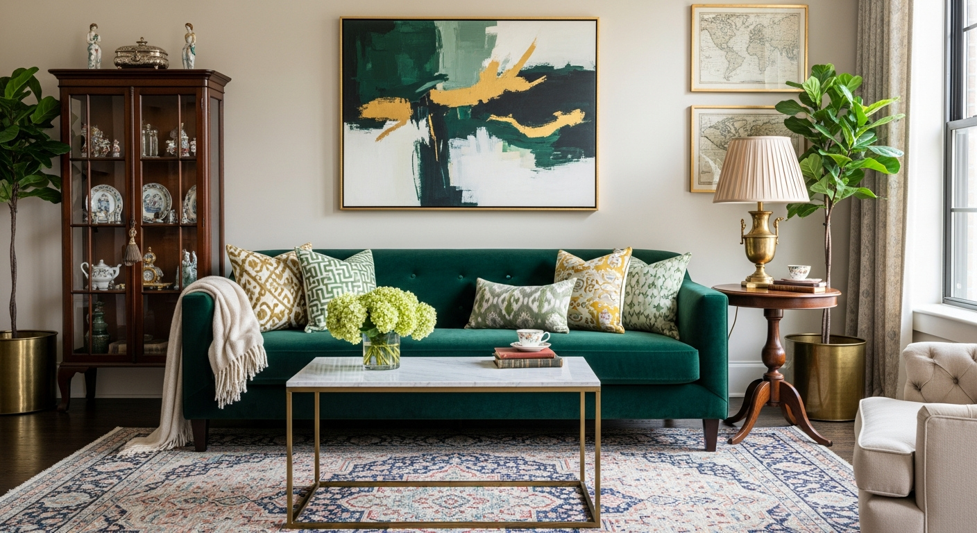
A statement sofa, on the other hand, is about immediate impact. It’s the confident splash of emerald green velvet sofa, the playful pop of mustard yellow, or the sophisticated depth of a deep teal. These aren’t just pieces of furniture; they are declarations of style, designed to be the room’s undeniable focal point. They inject personality, energy, and a touch of drama that transforms a mundane living area into a conversation starter.
The challenge, and indeed the art, lies in marrying these two strong personalities. A vintage rug, with its often complex palette and intricate patterns, can either sing in harmony with a statement sofa or clash in a cacophony of competing visuals. Our goal is to ensure a symphony of style.
Understanding Color Theory and Dominance
The foundation of any successful design pairing, especially when dealing with bold colors and intricate patterns, is a solid grasp of color theory. This isn’t about rigid rules, but rather understanding how colors interact and influence each other.
Key Color Theory Concepts:
- Dominant Colors: Identify the most prominent color(s) in your vintage rug. This might be a bold red, a deep blue, or a more muted overall tone. Similarly, your statement sofa’s color is its dominant hue.
- Secondary & Accent Colors: Look for the smaller splashes of color within the rug’s pattern. These are often the bridge colors that can tie into your sofa or other room elements.
- Undertones: Every color has an undertone—warm (yellow, orange, red) or cool (blue, green, purple). A sage green sofa might have a cool blue undertone, while a terracotta rug might have a warm orange undertone. Understanding these subtle nuances is crucial for harmony.
- The 60-30-10 Rule: This classic design principle suggests that 60% of a room should be the dominant color, 30% a secondary color, and 10% an accent color. While flexible, it’s a great guideline for maintaining balance, especially when you match vintage rug to sofa and other decor elements.
Strategies for Harmonizing Hues
Once you’ve analyzed the colors, it’s time to strategize your pairing:
Complementary Contrast
This strategy involves pairing colors that are opposite each other on the color wheel (e.g., red and green, blue and orange). If your sofa is a vibrant teal velvet sofa, consider a vintage rug that features faded oranges, rusts, or even some warm yellow tones. The contrast creates energy and visual interest, but requires careful balancing to avoid overwhelming the space. Look for rugs where the complementary color appears in smaller doses or as a muted secondary shade to ensure the contrast is sophisticated, not jarring.
Analogous Harmony
Analogous colors are next to each other on the color wheel (e.g., blue, blue-green, green). This creates a sense of calm and cohesion. If your sofa is a deep navy, a vintage rug with various shades of blue, green-blue, or even some subtle greens can work beautifully. The key here is to vary the shades and intensities to add depth without sacrificing the harmonious flow. This approach often feels very sophisticated and curated, allowing different textures and patterns to shine without color competition.
Neutral Grounding
Sometimes, the best way to highlight a bold sofa is with a more subdued rug. A statement sofa in fuchsia or sunshine yellow can be beautifully grounded by a vintage rug predominantly in cream, grey, beige, or even a soft, faded black. This allows the sofa to be the undisputed star while the rug provides a rich textural and historical backdrop without competing for color dominance. Conversely, a highly colorful, pattern-rich vintage rug might benefit from a solid, neutral-colored sofa to let the rug truly shine.
Pattern Play
Mixing patterns can be tricky, but incredibly rewarding. The secret lies in varying scale, density, and type. If your vintage rug has a dense, intricate floral pattern, pair it with a solid-colored sofa or one with a subtle, geometric texture (like a ribbed corduroy or a textured linen). If the rug features large, open geometric shapes, a small-scale patterned sofa or a subtle striped one might work. Always aim for one dominant pattern, with others playing a supporting role. Consider the overall vibe you’re aiming for – bohemian, eclectic, or more refined – as this will guide your pattern choices.
Texture Talk
Texture adds another layer of sophistication. A plush velvet sofa can contrast beautifully with a flat-woven kilim rug, while a crisp linen sofa might find its match in a soft, high-pile Moroccan rug. Don’t underestimate the power of tactile differences to enhance visual appeal and comfort. The interplay of soft, hard, smooth, and rough can elevate your room’s aesthetic significantly.
Identifying Your Vintage Rug Style
Understanding the common styles of vintage rugs can help predict their color palettes and patterns, making the matching process easier:
- Persian Rugs: Often rich in jewel tones (deep reds, blues, greens) with intricate, curvilinear patterns. They exude formality and luxury. Examples include Kashan, Tabriz, and Heriz.
- Turkish/Anatolian Rugs: Known for their slightly coarser weave and often more geometric or tribal patterns. Oushak rugs, for instance, are famed for their softer, muted palettes and larger, more open motifs, making them incredibly versatile to match vintage rug to sofa in a modern setting.
- Moroccan Rugs: Characterized by their plush pile and often minimalist, abstract, or tribal geometric patterns. Beni Ourain rugs, in particular, are typically cream or ivory with black/brown geometric lines, perfect for contemporary spaces.
- Kilim Rugs: Flat-woven, without a pile, often featuring bold geometric patterns and vibrant colors. They offer a more casual, bohemian vibe.
- Bokhara Rugs: Originating from Central Asia, these feature repeating “gul” (elephant’s foot) motifs, usually in rich reds, browns, and blues.
Statement Sofa Colors – What Works Best?
Let’s consider how different bold sofa colors can interact with vintage rugs:
- Emerald Green: A regal color. Pair with vintage rugs featuring warm, earthy tones like rust, terracotta, or faded gold. For a cooler, more serene look, rugs with muted blues or creams can create a sophisticated sanctuary.
- Navy Blue: Incredibly versatile. Works with almost any vintage rug. For high contrast, look for rugs with reds, oranges, or yellows. For a calmer aesthetic, opt for rugs with lighter blues, greens, or greys.
- Mustard Yellow: A cheerful, retro hue. Complements vintage rugs with deep blues, charcoal greys, or rich, earthy browns and burnt oranges. It also pairs beautifully with lighter, creamy Moroccan rugs.
- Deep Teal: Sophisticated and intriguing. Best paired with vintage rugs that incorporate blush pinks, soft corals, golds, or light greys. Rugs with subtle patterns in these complementary shades will enhance the teal without overwhelming it.
- Burgundy/Oxblood: A rich, warm tone. Vintage rugs with muted greens, creams, or even other shades of deep red and gold create a luxurious, old-world feel.
- Blush Pink: Soft yet striking. Looks ethereal with vintage rugs in grey, white, light blue, or even some faded sage greens. Moroccan rugs are often a fantastic match for blush sofas.
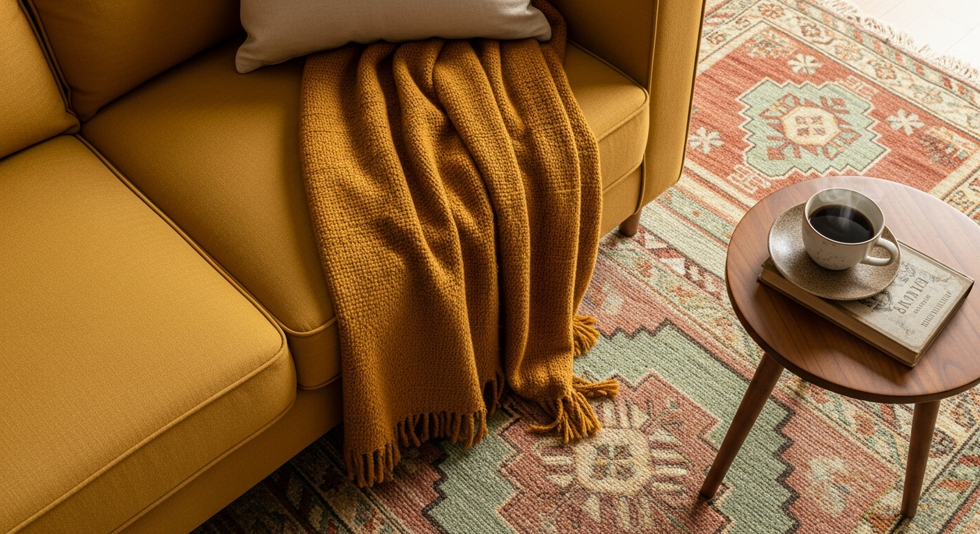
Discover how a vintage Oushak rug can perfectly match a statement mustard yellow sofa, creating warmth and character.
Comparison Table: Vintage Rug Styles vs. Statement Sofa Colors
This table offers a quick reference for pairing different vintage rug styles with popular statement sofa colors:
| Statement Sofa Color | Best Vintage Rug Styles | Why it Works |
|---|---|---|
| Emerald Green | Persian (Heriz, Tabriz) with rust/gold, Oushak with creams/pinks | Warm contrast or sophisticated analogous blend. |
| Navy Blue | Kilim with reds/oranges, Turkish with light blues/greens, Bokhara | Versatile; allows for bold contrast or serene harmony. |
| Mustard Yellow | Moroccan (Beni Ourain) with black lines, Oushak with terracotta/sage | Neutral grounding or complementary warmth. |
| Deep Teal | Persian (Kashan) with faded pink/gold, Turkish with grey/cream | Creates a luxurious, sophisticated balance through soft contrast. |
| Blush Pink | Moroccan (Azilal) with muted tones, Vintage Dhurrie with grey/white | Soft harmony and adds textural depth. |
Practical Tips for a Flawless Match
Beyond theory, here are actionable tips to ensure your vintage rug and statement sofa pairing is perfect:
- Consider the Room’s Overall Aesthetic: Is your space bohemian, minimalist, eclectic, or traditional? Your rug and sofa choice should support this overarching theme. A vibrant velvet sofa modern in design might call for a contemporary vintage rug like a Beni Ourain, rather than a heavily patterned Persian.
- Size Matters: The rug should be large enough to anchor the sofa, with at least the front two legs of the sofa sitting on it. Ideally, the rug extends beyond the sofa’s width by several inches on each side. A rug that’s too small will make the room feel disjointed.
- Embrace Imperfections: Vintage rugs are rarely pristine. Fading, wear, and minor inconsistencies are part of their charm. Don’t seek perfection; seek character. These quirks often make them easier to pair with bold, modern furniture, softening the overall look.
- Lighting is Key: Colors can appear dramatically different under various lighting conditions. Natural daylight reveals true hues, while warm artificial light can make colors richer and cooler light can make them appear brighter. If possible, test rug samples in your room at different times of day.
- Bring Home Samples: Before committing, try to bring a swatch of your sofa fabric or, even better, a small rug sample into your space. See how the colors interact under your home’s unique lighting and with existing decor.
- Layering: If you love a small vintage rug but need more coverage, consider layering it over a larger, neutral jute or sisal rug. This adds depth and allows you to incorporate more patterns without overwhelming the space.
Beyond the Sofa – Accessories and Cohesion
Once you’ve mastered how to match a vintage rug to a statement colored sofa, the next step is to extend that harmony throughout the room with thoughtful accessories.
- Throw Pillows: These are your best friends for bridging colors between your sofa and rug. Pick out accent colors from the rug and echo them in your throw pillows. Introduce different textures and patterns in your patterned throw pillows living room to add interest without competing with the main elements.
- Art and Wall Decor: Select artwork that incorporates colors from both your sofa and rug. This creates a visual triangle that pulls the eye around the room and reinforces the cohesive palette.
- Curtains and Drapes: Choose window treatments that either match a subtle tone in the rug or sofa, or are a neutral color that complements both. Avoid introducing another strong pattern or color unless it’s very intentional and balanced.
- Other Furniture: Wooden tables, metallic accents, or painted bookshelves can also play a role. A rich dark wood coffee table might ground a bright sofa and rug, while lighter woods or glass can maintain an airy feel.
- Maintenance: Vintage rugs, especially, require careful upkeep. Invest in a good rug spot cleaner vintage friendly and vacuum regularly. Proper care will preserve their beauty and ensure they continue to enhance your statement sofa for years to come.
Frequently Asked Questions (FAQs)
Q1: Can I mix modern patterns in a vintage rug with a traditional sofa?
Absolutely! Mixing modern patterns from a vintage rug (like a geometric Berber) with a more traditional sofa can create a wonderfully eclectic and contemporary look. The key is to find a common color thread or to use a neutral sofa to let the rug’s pattern be the star.
Q2: My vintage rug has many colors. How do I choose a statement sofa color?
If your vintage rug is very colorful, pick one or two less dominant colors from the rug’s pattern and choose a sofa in one of those hues. Alternatively, select a neutral sofa (e.g., charcoal grey, cream, or beige) to allow the rug’s vibrant palette to truly pop without competition.
Q3: What if my vintage rug’s colors are very faded?
Faded vintage rugs are perfect for balancing very bold statement sofas. Their muted tones provide a soft, historical backdrop that prevents the vibrant sofa from feeling overwhelming. Look for undertones in the faded rug that complement the sofa’s color.
Q4: Should the rug be lighter or darker than the sofa?
There’s no strict rule. A darker rug can anchor a lighter sofa, creating a sense of grounded elegance. A lighter rug can make a dark sofa stand out more boldly, adding a fresh contrast. Consider the overall brightness of your room and the mood you want to create.
Q5: How do I ensure my choices don’t look ‘messy’ or uncoordinated?
The best way is to maintain a consistent style or a deliberate contrast, rather than accidental clash. Stick to a limited color palette (3-5 main colors) across the room. Use varying scales of patterns and textures. And remember, trust your eye! If it feels balanced and pleasing to you, it’s a success.
Your Masterpiece Awaits!
Pairing a vintage rug with a statement colored sofa is more than just decorating; it’s about curating a space that reflects your unique taste and tells a story. By understanding color theory, embracing different styles, and trusting your instincts, you can create a living room that is not only visually stunning but also deeply personal and inviting. Don’t be afraid to experiment, to combine the old with the new, and to let your personality shine through. Explore the endless possibilities and transform your home into a true masterpiece!